Thursday 15 December 2011

More ideas for the digipack!

I am still inspired from this type of digipack cover and have designed some ideas for my digipack with the same effects, shown below:

Most of the designs shown here are ideas which would be used for the front of the digipack. This includes all apart from the bottom left design which is an idea for the back of the digipack. These are all ideas that I am developing on and using to work to an end result.


I am still yet to do another photoshoot of Ed in the location in which I will be filming which is shown on my blog in previous posts. I think the colours of the location will work well with the black and white effect photos I have already.

Friday 9 December 2011

Digipack Development

After designing the digipack template, I was able to insert different photos and play about with effects. I used the photos that I took in my first photoshoot, however I am planning on doing another photoshoot and am also going to take stills when I am filming. I think including photos from the filming locations would look good as it would carry out continuity.
So far, I have these examples:
   

Thursday 8 December 2011

Feedback for my finished poster

In class, we showed each other the ancillary tasks we had finished and gave each other feedback on what did and didn't work. I was pleased with the feedback I got as my classmates were able to identify the genre of my track and were able to understand why I created a poster with very little detail. Some of the comments I got were:

"I like the continuity of the red with the stars at the top and the record label at the bottom, it works well" Alice
"The space in the middle is good, it demonstrates a rule of thirds and constructs a heavy feel" Emma
"I can see that it is alternative rock" Isaac

Designing the Digipack

In order to start designing my digipack, I had to find a template to design around. I found a template on the internet and copied it onto adobe illustrator. To make things easier, I made my own template by drawing over the top of the one I had found.

I chose to do a six panel digipack opposed to a four panel or eight panel. I thought this was most appropriate as I don't want it to be under detailed, but at the same time, I don't want it to be over detailed. I am still going to try to keep the digipack simple, similar to the poster as I think it sets the right mood and delivers the correct message.

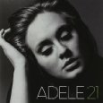
Below are examples of simple digipack covers that I have taken some inspiration from. Adele keeps her poses very simple with the black and white effect which really suits her music style. I also think the style of my song is very similar to hers in many ways although the genres are different which is why I have taken inspiration from her album covers in particular.


Thursday 1 December 2011

Final Magazine Advertisement!

So, here is my final magazine advertisement! After lots of time and helpful feedback, I have finally reached my end result!

Last two choices for Ad!

I now have two final designs to choose from for the final magazine advertisement. There are subtle differences between the two but I think they make all the difference. For the final time, I got feedback from some of my fellow students and this was the outcome...

                                Likes: 6                                   Likes: 1

"The record label and amazon logo ruin the black image when they are on the left" - Isaac White (fellow media student) 

"The whole image just looks better with all of the text grouped together on the right" - George Attwill (fellow media student)