Showing posts with label Research and Planning. Show all posts
Showing posts with label Research and Planning. Show all posts
Friday, 24 February 2012
Alternative Rock music videos
Arctic Monkeys 'Crying Lightning'.
The lighting is low key and there is a narrative as well as band performance.
Dido 'Here with me'
The lighting here is low key. It is purely narrative with no band performance.
Enter Shikari 'Quelle Surprise'
This falls into the alternative rock genre. The lighting is low key with only dark colours included and is 100% band performance with no narrative.
Foo Fighters 'Dear Rosemary'
This music video has low key lighting and is 100% narrative based with no band performance.

Tuesday, 21 February 2012
Storyboard
I made a storyboard to get my ideas down on paper. I also did it so I know exactly what shots I need to get when filming. I can have this in front of me when I go and film so it makes it easier for me to remember what to include and what angles to film from.

.jpg)
.jpg)
.jpg)
.jpg)
.jpg)
.jpg)

.jpg)
.jpg)
.jpg)
.jpg)
.jpg)
.jpg)
Inspiring music video
'Drunk' by Ed Sheeran carries some ideas that relate to a few of mine. This video is about him getting drunk to feel better about breaking up with his girlfriend. The ideas I have for my music video include alcohol and drinking to feel better about life and to try to get through the bad dreams and the sleepless nights that the character has.

Ed Sheeran's video carries a slightly more comical feel to it which is shown through the appearance of the cat. However, I like the shots that are used to show flashbacks of the girl and to show that Ed is thinking of her and missing her. I think shots like this could work well in my music video. I could include them between shots of him walking to the pub and drinking. This would work well as it would enlighten the audience to the fact that he is depressed and upset because he misses how his relationship with his girlfriend used to be and he is struggling in life which is why he drinks and gets up in the middle of the night and walks to the pub to get more alcohol.

Shots in the sunlight of them laughing and cuddling whilst holding hands is what I have in mind. This would be effective as it would show their past happiness and would make it clear that this is what he is thinking about on his walk and is what he is so unhappy about. I will have to adjust the saturation and the brightness levels to make it clear that the shots of them together are flash backs so they fit in and do not look odd throughout the video.
Friday, 6 January 2012
Video containing similar shots to my ideas..
These New Puritans 'Elvis' - Director: Saam Farahmand from Tom Lindsay on Vimeo.
Above is a video very different to what I will be producing, however it has shots and ideas similar to mine.

I want to include shots similar to this in my video. I am planning on putting a spotlight behind Ed's head so I get a silhouette of the side of his face which I think will be very effective when he lip syncs the lyrics.

I also like this shot as the facial expression on this girls face shows upset/troubled emotions which relates to the emotions in my track. Therefore, I will ask Ed to use these facial expressions in order to deliver the emotions of the song.

Wednesday, 4 January 2012
Developed Ideas for the music video
Whilst continuing the design and production of the digipack, I have been thinking of more ideas for the video.
I would like to include shots of Ed's mouth alone as he is singing the lyrics with dim lighting as I feel this will fit the genre.
Locations such as the beach with a sunset and maybe somewhere like a field at night time when there is minimal lighting or when it is really cloudy, or even raining as I dont want bright lighting.
Another one of my ideas is to include shots of Ed's silhouetted face whilst he is singing and maybe some longer shots of him sat down looking at the floor with dim lighting whilst singing. I have not yet found any real material to show what I mean as these are just ideas I have thought up.
To help show these ideas, I will take photos of the shots I would like to use and post them up on my blog. I will also keep searching for real media products with these similar shots!
I would like to include shots of Ed's mouth alone as he is singing the lyrics with dim lighting as I feel this will fit the genre.
Locations such as the beach with a sunset and maybe somewhere like a field at night time when there is minimal lighting or when it is really cloudy, or even raining as I dont want bright lighting.
Another one of my ideas is to include shots of Ed's silhouetted face whilst he is singing and maybe some longer shots of him sat down looking at the floor with dim lighting whilst singing. I have not yet found any real material to show what I mean as these are just ideas I have thought up.
To help show these ideas, I will take photos of the shots I would like to use and post them up on my blog. I will also keep searching for real media products with these similar shots!
Thursday, 8 December 2011
Designing the Digipack
 In order to start designing my digipack, I had to find a template to design around. I found a template on the internet and copied it onto adobe illustrator. To make things easier, I made my own template by drawing over the top of the one I had found.
 I chose to do a six panel digipack opposed to a four panel or eight panel. I thought this was most appropriate as I don't want it to be under detailed, but at the same time, I don't want it to be over detailed. I am still going to try to keep the digipack simple, similar to the poster as I think it sets the right mood and delivers the correct message.
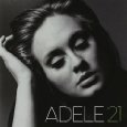
Below are examples of simple digipack covers that I have taken some inspiration from. Adele keeps her poses very simple with the black and white effect which really suits her music style. I also think the style of my song is very similar to hers in many ways although the genres are different which is why I have taken inspiration from her album covers in particular.



Thursday, 10 November 2011
Finalisation of names
After realising that I could not proceed any further without deciding what names I will use for the Artist, Track and Album, I finally chose what to use! I was not happy with the names I had thought of for the Artist name and therefore googled 'UK male names' which actually really helped me. After going through every male name in my head and trying to picture it on a didgipack for my particular track, I realised that a short, sharp name works well. I got this from 'Dan Lowe' that I originally thought of and therefore I have chosen to use the name Rob Young. I put this by classmates to see what they thought and they all agreed with my choice!
All along, I have liked the album name 'Unconcious Living' as I think it works well with the vibe of the song. I also think it fits becasuse the artist has a distinct voice and I imagine him making an album with consiting of very similar songs. So, to confirm...I will be naming the album Unconcious Living.
I have inspiration from my previous ideas for the track name. 'You see the bad in me' is one of the ideas I like, however I thought it was too long and therefore I have decided to shorten it down to The bad in me.
After finally decidng the names, I can now get on with producing my digipack and poster!
All along, I have liked the album name 'Unconcious Living' as I think it works well with the vibe of the song. I also think it fits becasuse the artist has a distinct voice and I imagine him making an album with consiting of very similar songs. So, to confirm...I will be naming the album Unconcious Living.
I have inspiration from my previous ideas for the track name. 'You see the bad in me' is one of the ideas I like, however I thought it was too long and therefore I have decided to shorten it down to The bad in me.
After finally decidng the names, I can now get on with producing my digipack and poster!
Thursday, 3 November 2011
Feedback Followup
After getting feedback from my peers about the look of my actor yesterday, I decided to modify his clothing colours to see how the darker clothing would look. Instead of hunting down my performer to do another shoot in different, darker clothes, I decided to do a quick colour edit of his hair and his clothing on adobe photoshop and this is what I came up with...


Thursday, 27 October 2011
Location Shoot
I live in Bransgore which is a small village and is relatively quiet. I went down to the shops where there are street lights and took a few photos just to get a feel of the location and to decide whether I will use it in my video. It will work for the shots when my character walks along looking down at the floor and other shots such as lip synching whilst walking along. However I may need to consider another location which is busier at night so I can have more of an atmosphere and my character can act like he does not fit in and portray anxious, worried emotions.


Research into The Script
From realizing that The Script have produced a similar music video to what I'm going for, I decided to look into their CD covers and any posters they have for inspiration for my ancillary task.
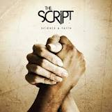


Above are a selection of the CD covers from The Script. These are a good example of what I will be doing for my digipack. The facial expressions of the band match what my character will look like. These expressions show maturity opposed to a band singing parody songs etc. You can tell from the cover of these albums that the songs may be emotional and include the genre of 'soul'. The colours help connote this, especially the top-left and bottom-right CD covers. They are sinister and gentle colours opposed to bright, loud colours that may portray up beat songs.


Above are a selection of the CD covers from The Script. These are a good example of what I will be doing for my digipack. The facial expressions of the band match what my character will look like. These expressions show maturity opposed to a band singing parody songs etc. You can tell from the cover of these albums that the songs may be emotional and include the genre of 'soul'. The colours help connote this, especially the top-left and bottom-right CD covers. They are sinister and gentle colours opposed to bright, loud colours that may portray up beat songs.
I also noticed from these covers that the main singer has the 'star image'. He is the biggest person on the cover and is also at the front to show he is the face of the band. I will be using this method on my digipack- a close-up of Ed (my actor) will help to secure his face to his music which will then help to attract the target audience.


The posters share the same characteristics of the 'star image' effect as the CD covers. Black and white is an effect I am very keen on using due the mellow mood created by the track I am making the video to.
Tuesday, 25 October 2011
Photo Shoot
I did a photo shoot of Ed, my actor in the clothes that I intend on filming him in. The purpose of this was to create the look of the character and to get some photos together to enable me to begin adding effects and editing them for ideas for the digipack. The photo shoot went really well and I took a range of photos from different angles. Ed pulled facial expressions to show a 'sad', 'mellow' mood to fit with the feel of the track. I used black and white effects to enhance this mood more as the plain, dull colours contribute to the same mellowness of the track.


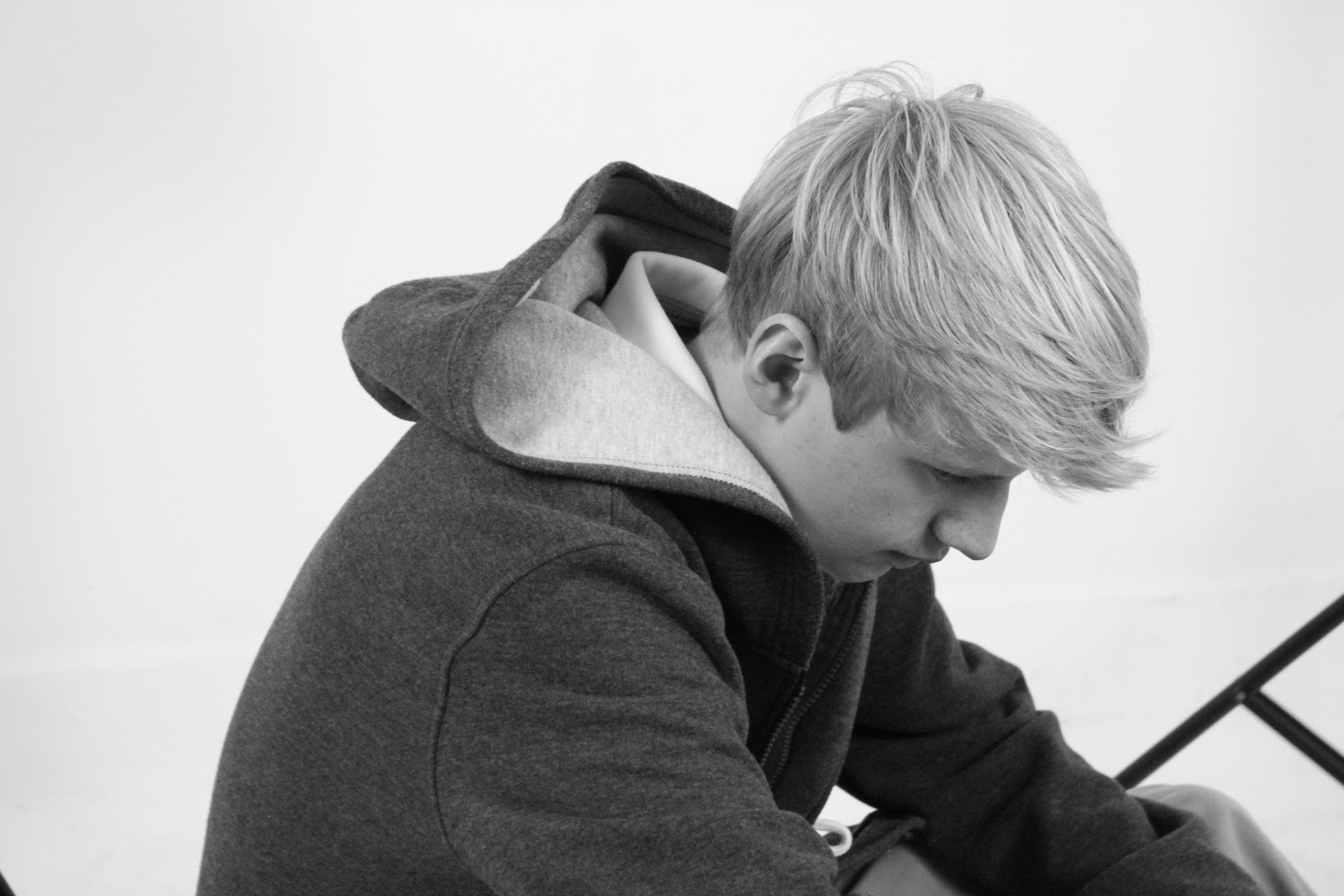
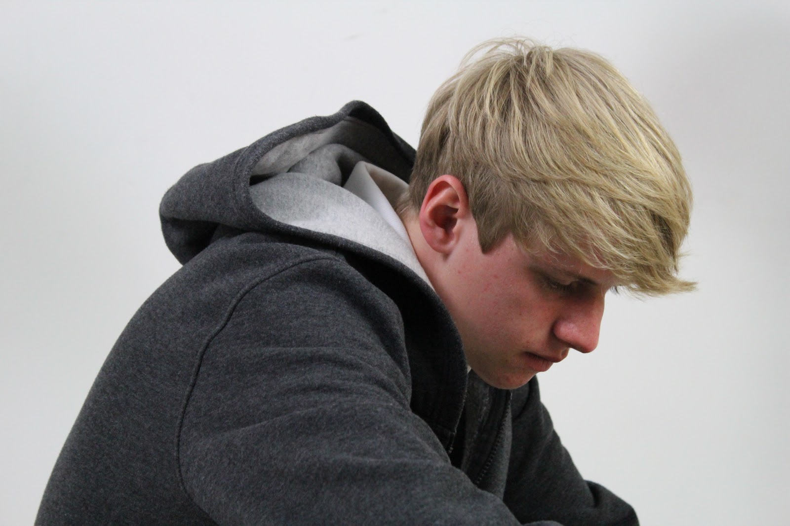


These are a selection of photos from the photo shoot. Some are edited and others I have left as I took them. The black and white photos have not been edited, I took them with the black and white mode on the camera which is really useful when I come to filming the black and white shots.
Inspiration
I have been thinking about what I want my music video to look like. Here is some inspiration.
The low angle shots of his feet are what I would like to include in my music video. They connote sadness and 'low' moods which is ideal for the track I am doing my music video to.
The facial close ups are also relevant to what I want to include in my video as they show expressions and emotions. This will help to show the feelings of the character which are delivered through the song.
One of the differences that there is between the ideas of my music video and this one is the lip syncing. I do not plan on having the character in my music video lip syncing the whole way through as I feel it creates more of a mellow mood.
Slow head movement and looking down on the ground, (shown by low-angle close ups) is what the main focus of my music video will be. I will use many shots to show the emotions of my character as the song is very emotionally focussed.
I am undecided..but I may include some performance shots. This would include Ed (the main character) singing in to a microphone with dark lighting in a plain room (maybe one of the studios at school)
From looking at this video, I have noticed that to make it look professional, I need a wide variety of shots and I need to edit them together so there is a constant change to keep the viewer intrigued.
The low angle shots of his feet are what I would like to include in my music video. They connote sadness and 'low' moods which is ideal for the track I am doing my music video to.
The facial close ups are also relevant to what I want to include in my video as they show expressions and emotions. This will help to show the feelings of the character which are delivered through the song.
One of the differences that there is between the ideas of my music video and this one is the lip syncing. I do not plan on having the character in my music video lip syncing the whole way through as I feel it creates more of a mellow mood.
Slow head movement and looking down on the ground, (shown by low-angle close ups) is what the main focus of my music video will be. I will use many shots to show the emotions of my character as the song is very emotionally focussed.
I am undecided..but I may include some performance shots. This would include Ed (the main character) singing in to a microphone with dark lighting in a plain room (maybe one of the studios at school)
From looking at this video, I have noticed that to make it look professional, I need a wide variety of shots and I need to edit them together so there is a constant change to keep the viewer intrigued.
Thursday, 20 October 2011
Background Research - Arctic Monkeys
Arctic Monkeys are an English indie rock band. I wanted to look at some posters and digipack covers by a band of this genre to get some inspiration on fonts, layout and graphical features.


Here are four examples of the posters from the Arctic Monkeys.I like the one on the top-right. It is very 'indie' and individual. However, the other three are very 'comic' like. The fonts are similar to each other which carries continuity. However, the bottom left poster had bold, plain font. This is what most appeals to me for my poster, I do not plan on using any funky font as it would not sell my track correctly.


Above are some album covers for the Arctic Monkeys. The top two relate to my ideas with the black and white effect. I really want to include this in either my poster (possibly both) as I think it really relates to the mood given from the song. There are no colourful moods represented in the song, it is very emotional-but depressing which I think is what black and white is good at connoting if used correctly.
The fonts here are similar to those on the posters which I should keep in mind as I may need to use the same fonts for continuity purposes!


Here are four examples of the posters from the Arctic Monkeys.I like the one on the top-right. It is very 'indie' and individual. However, the other three are very 'comic' like. The fonts are similar to each other which carries continuity. However, the bottom left poster had bold, plain font. This is what most appeals to me for my poster, I do not plan on using any funky font as it would not sell my track correctly.


Above are some album covers for the Arctic Monkeys. The top two relate to my ideas with the black and white effect. I really want to include this in either my poster (possibly both) as I think it really relates to the mood given from the song. There are no colourful moods represented in the song, it is very emotional-but depressing which I think is what black and white is good at connoting if used correctly.
The fonts here are similar to those on the posters which I should keep in mind as I may need to use the same fonts for continuity purposes!
Subscribe to:
Posts (Atom)